Take Advantage of Web-Based Tools to Present Complex Data

Research to Action published a great overview article that highlights an “ever-growing open-data source for development statistics in the fields of economics, healthcare, education, social science, technology,” and more.

Including data and statistics within research findings can enhance their impact, however, large tables or spreadsheets of numbers take time to decipher and sometimes the true meaning behind the data itself can be misinterpreted.

Here are some of the tools that the article points out:

  • StatPlanet: browser-based interactive data visualization and mapping application to create a wide range of visualizations, from simple Flash maps to more advanced infogrpahics.
  • Xtimeline:  to create your own timelines of data.
  • Gap Minderto upload data and create an interactive motion charts and graphs.
  • Creately:  to use Online Diagramming software – purpose built for team collaboration.
  • Google Chart Tools: lets you include constantly changing research data sourced online. Google has also released Fusion Tables where you can share, discuss and track your charts and graphs with specific people online.
  • Tagcrowdto upload texts and highlight the most common concepts. The clouds can be exported as images and inserted in a website or power point presentation.
  • Wordle: similar to tagcloud; lets you create images out of key phrases and words relevant to your research, great for using in PowerPoint presentations.
  • Tableau: a free Windows-only software for creating colourful data visualisations.

View all and read the original article

Cigarette warning labels around the world

The FDA’s new cigarette warning labels have been getting a lot of buzz, underscoring the role of design in public health communication. The new designs take up half the cigarette pack, and 20% of the size of ads. According to the Wall Street Journal, the FDA estimates that the design will reduce the number of smokers by over 200,000 in the first year after launch, based on the impact of new warning labels in Canada.

Cigarette Health Warning ImagesCigarette Health Warning ImagesCigarette Health Warning ImagesCigarette Health Warning Images

There are a variety of approaches to tobacco packaging warnings, but bold graphic warnings are clearly the emerging international consensus. Here are some examples from around the world:

Brazil:
Cigarette warning labels

Thailand:
Gruesome

Click to see more…

Compelling Video Describes New Visualization Tool “Many Eyes”

It can be challenging to create animated video that conveys a complex message. Here is a great example that shows it’s doable – mind you, without a single spoken word.

A 60 second social story about developing and refining ideas, gaining insight and sharing through community; all based on the premise that many sets of eyes are better than one!

Take a look and let me know what you think. – Btw, the visualization tool “Many Eyes“, developed by IBM, is worth a look as well.

Interactive Biomedical Data Visualization

TripleMap

Continuing our theme of visualization, it looks like some pretty interesting tools are continuing to be developed.  One example is called TripleMap:

TripleMap is a data-driven software framework which gives biomedical research scientists access to massive interconnected networks of life science data. Using TripleMap you can analyze, visualize and share this information by creating “maps” of associated data which are relevant to your research.

Using a proprietary algorithm called Inferential Connectivity Analysis (ICA), TripleMap can identify connections for you between any two entities in its network. Want to know about potential connections between a protein and a disease? Want to know about potential connections between a compound and a cellular pathway? With ICA, TripleMap can perform a comprehensive, “deep” traversal of the entire TripleMap data network and identify any connecting entities. How powerful is identification of novel connections? It can be the difference between success and failure, novel insight and (less than) blissful ignorance.

Although they’re still in a closed “alpha” mode, the developer told me that they will be integrating the MedDRA ontology into it over the weekend, and he’ll send me a trial code early next week.  I’ll post a follow-up after I give it a try.

visualcomplexity.com | A visual exploration on mapping complex networks

visualcomplexity.com | A visual exploration on mapping complex networks.

I found an interesting site for interesting visualizations of networks… here’s their description of what this site is about:

VisualComplexity.com intends to be a unified resource space for anyone interested in the visualization of complex networks. The project’s main goal is to leverage a critical understanding of different visualization methods, across a series of disciplines, as diverse as Biology, Social Networks or the World Wide Web. I truly hope this space can inspire, motivate and enlighten any person doing research on this field.

Visualizations vary

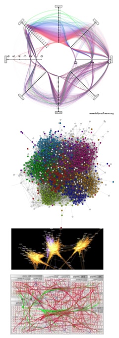
Visualizations aren’t set in stone. Five network visualization developers recently did a cook-off at University College Dublin’s Visual Analysis of Complex Networks workshop, each using his or her own tools to represent a large dataset of college Facebook friendship data.

The results and conclusions are wildly different, reflecting the art and science of extracting and visualizing meaning.

Link

A Tool to See How Others View our Website

Last month we launched our new home page. We pondered about what content should be above the fold, and how the new design will play out using different browsers. At that time, I did not know about the new tool Browser Size launched by Googlelabs. Browser Size makes it possible to test how others view our page, taking in account different sizes of monitors, browsers that are not always full screen and toolbars. It looks like a helful tool to save time during testing across browsers.

Here is how it works according to the creators: “Special code collects data on the height and width of the browser for a sample of users. For a given point in the browser, the tool will tell you what percentage of users can see it. For example, if an important button is in the 80% region it means that 20% of users have to scroll in order to see it.”

Keep reading at Introducing Google Browser Size

The North Carolina Translational and Clinical Sciences Institute Launches Website

I think this is an interesting example for a CTSI website.  Several graphical elements are used on the site.

I like the Research Services Page that includes a graphical element guiding to “Contact an Expert”. I also find the Find a Collaborator Page useful. Take a look!

Text Miners: The “Power of Semantic Enhancement”

I find this an excellent example how a basic review article originally published in PLoS Neglected Tropical Diseases can be enriched in its content. Even though this might be more relevant to general knowledge management, I would be interested in exploring whether we could apply some of these tools to the Virtual Home portal.

Computational biologists used tagged terms such as disease names, institutions, places, people, organisms, which can be turned off and on. If you click on document summary you will find not only a study summary, but also a tag cloud of highlighted terms, tag trees of individual semantic classes of highlighted terms, ontology terms, document statistics, and a citation analysis.

As Evie Browne, Publication Manager, PLoS Computational Biology writes: “With a single click you can re-arrange the reference list by number of times each paper is cited, or add in the authors’ analysis of how the reference is used in the paper (obtains background from, confirms, extends, shares authors with, uses method in). The group has also provided interactive versions of some of the figures: compare the original, static Figure 3 to the moveable, overlaying, enhanced version.”

More information about semantic publishing is available in the original article.