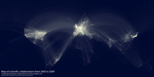
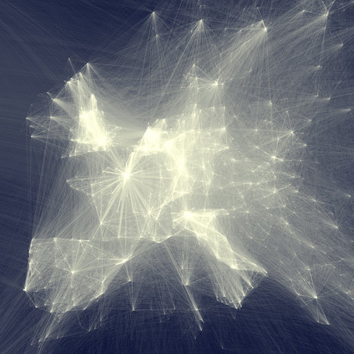
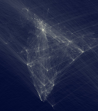
Olivier H. Beauchesne from Science-Metrix designed a lovely map visualization of intra-institutional collaborations, as measured by publication data from sources like Scopus and Web of Science. Read Olivier’s blog post about the data and his methods or view a zoomable map.
One thought on “Scientific collaboration, visualized”
Comments are closed.


Pingback: Tweets that mention Scientific collaboration, visualized « -- Topsy.com